Let’s put the spotlight of one of Momentum’s offerings – eLearning platform/web development, and on our talented digital communications team.
Since its launch, the Cultural Heritage 2.0 website has attracted considerable favourable reactions from across Europe. Here we outline the process behind the planning and design of the website and creative response to the project objectives that resulted in the final website design.
The background to the project is grounded in the COVID- 19 pandemic which challenged many working in the cultural heritage sector to need a rapid push to develop new digital models of customer engagement. The Cultural Heritage 2.0 project responds to this need and supports HEIs to effectively assist the regeneration of the European cultural heritage sector in a highly digitalised post COVID-19 world. Led by Ca’ Foscari University of Venice, with partners in Austria, Denmark, Netherlands, and Ireland, the focus is on digital transformation, not only in the future scenario building research but also in the development and the delivery of a student consultancy course.
The first stage of the process of developing the project website was the development of a brand identity. The Momentum team developed a contemporary font, in black and white, black symbolises power and strength while evoking elegance and authority. We incorporated the letters C and H and included arrows to indicate the journey of digital transformation the sector is embarking on. A black and white brand echoes black and white photography, evoking the past while symbolising the focus on function and form when the distraction of colour is removed. The brand identity sits unobtrusively alongside the strong visual images used on the website and other project materials.
Taking on board the concepts adopted in creating the brand identity, our web designer Ivan Arapinac decided it would be important to design a website that created a clean, minimalist and contemporary feel. His website design provides large expanses of white space, and this space is similar across all browsers, devices and screen resolutions. He decided on a full-width webpage design that would automatically adjust to each user’s set up and provide a more immersive web browsing experience. A talented Digital Communication and eLearning Ivan has been with Momentum since 2020, not only a highly skilled web designer, he focuses on user experience and giving each website a unique brand voice that target users will engage the target users.

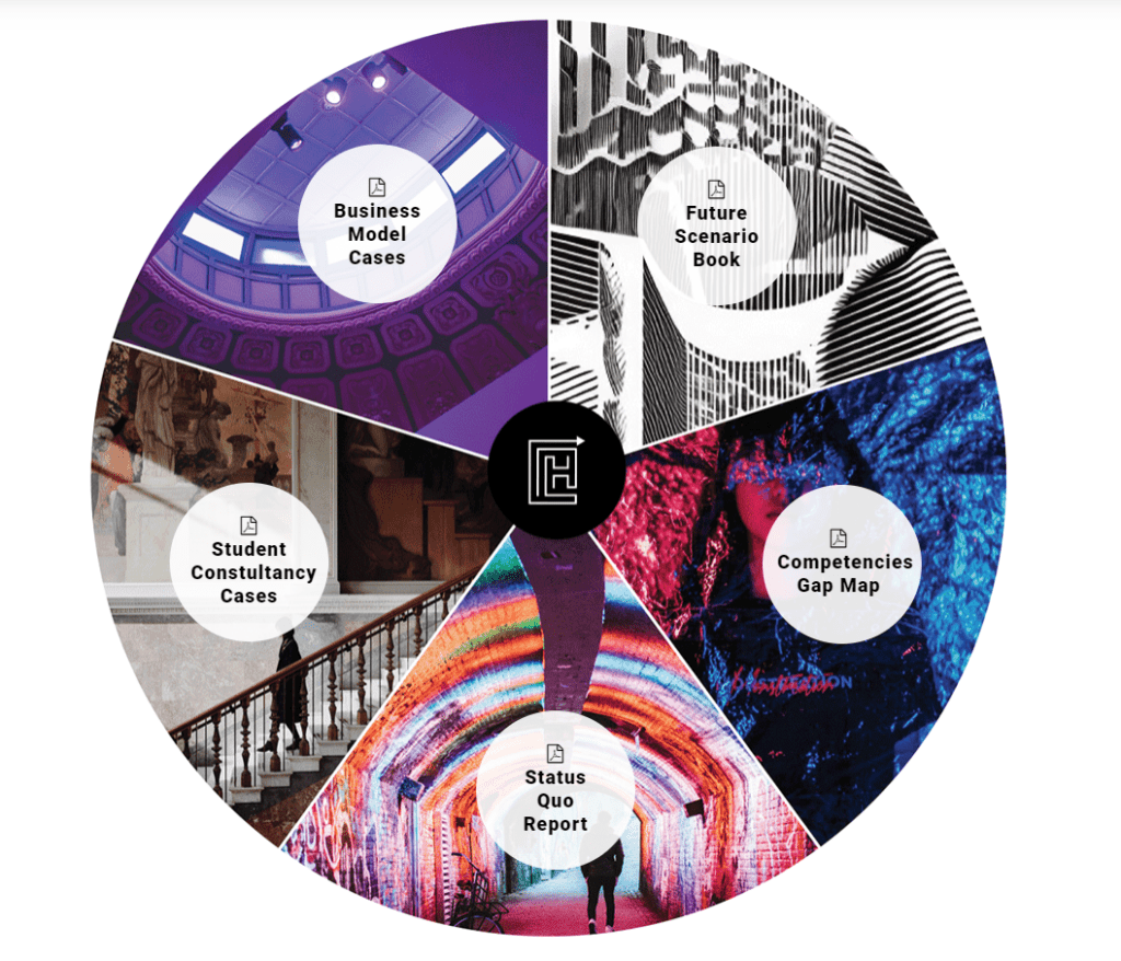
The website layout is clean and text is supported with very strong and powerful visual images. Again, the contemporary design helps to showcase the content and images and not distract from them unnecessarily. Clear navigation, signposting and calls to action offer a positive user experience and facilitate an easy user experience through the website. Design elements like the Future of Cultural Heritage Sector Scenarios spinning wheel effectively draw attention to downloadable resources while still maintaining the overall clean lines of the website.

According to Con Bartels, Sustainability and Culture specialist at Momentum, “The design of the Cultural Heritage 2.0 website effectively communicates the focus on digital transformation in a contemporary and elegant way, while creating a clean and immersive user experience.”
Follow the Cultural Heritage 2.0 on LinkedIn, Instagram or Tik Tok, and visit the website here
